
Understanding Research Visualization Tools
Research visualization tools are essential for modern researchers, helping to organize, analyze, and present complex information effectively. These tools come in various forms, each designed to address specific needs in the research process.
Types of Research Visualization Tools
Mind mapping tools: Excel at brainstorming and organizing ideas hierarchically
Concept mapping tools: Focus on showing relationships between ideas
Data visualization tools: Transform raw numbers into compelling charts and graphs
AI-powered research assistants: Analyze and visualize large volumes of academic papers
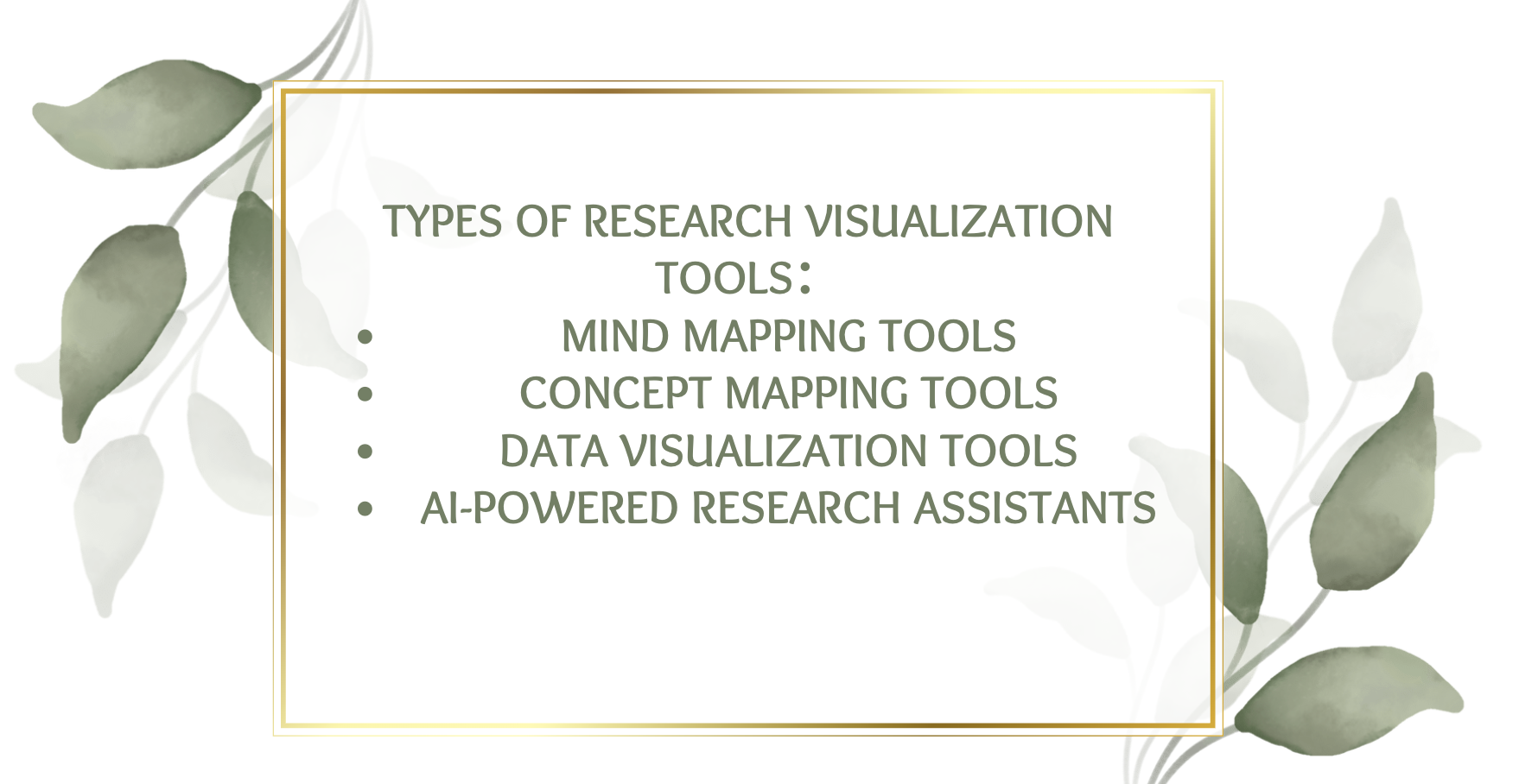
Each type of tool has its strengths, and the choice often depends on the nature of your research and the stage of your project.
Benefits of Using Research Visualization Tools
The advantages of incorporating research visualization tools into your workflow are numerous and impactful. They can improve comprehension and retention of complex information, enhance collaboration and communication of research findings, provide a common visual language, and reveal patterns and connections not apparent in raw data or text.
Assessing Your Research Visualization Needs
Identifying Your Research Goals
When selecting a research visualization tool, it's crucial to first clarify your primary research goals. Consider the complexity and scale of your research project as well. A simple mind mapping tool might suffice for a short-term project, but for long-term, multi-faceted research, you may need a more comprehensive platform that can handle diverse types of data and grow with your project over time.
Evaluating Your Technical Requirements
Assessing the technical aspects of research visualization tools is a critical step in making the right choice. Start by considering compatibility with your existing research tools and workflows. Evaluate the data input formats supported by the tool and consider its scalability and performance with large datasets if that's relevant to your work. Don't forget to assess the learning curve associated with each tool and whether it aligns with your team's technical skills and available time for training.
Key Features to Look for in Research Visualization Tools
AI-Powered Analysis and Insights
Artificial Intelligence has revolutionized the landscape of research visualization tools, offering capabilities that were once unimaginable. AI-powered tools can now analyze vast amounts of research data, extract key concepts, and even suggest connections that human researchers might overlook. This technology is particularly valuable when dealing with large-scale literature reviews or meta-analyses.
Collaboration and Sharing Capabilities
In today's interconnected research environment, the ability to collaborate effectively is paramount. Look for research visualization tools that offer robust collaboration features such as real-time collaboration capabilities, version control, comment or annotation features, and flexibility in output formats for sharing and presentation.
Comparing Top Research Visualization Tools
Traditional vs. AI-Enhanced Tools
When comparing research visualization tools, it's essential to understand the differences between traditional and AI-enhanced options:
Feature | Traditional Tools | AI-Enhanced Tools |
|---|---|---|
Learning Curve | Generally lower | Can be steeper |
Customization | High manual control | Adaptive and automated |
Data Processing | Limited to predefined functions | Can handle complex, unstructured data |
Insight Generation | Relies on user interpretation | Offers automated insights and suggestions |
Scalability | May struggle with very large datasets | Often designed for big data analysis |
Ponder stands out as a pioneering solution in the realm of AI-powered research visualization tools. Its standout features include:
Transformation of academic papers into interactive knowledge maps
Multi-document comparison for identifying similarities and differences
Integrated workflow combining search, reading, note-taking, and questioning
AI-powered responses to queries, acting as a knowledgeable research assistant
For researchers dealing with complex topics or vast amounts of literature, Ponder's ability to facilitate spatial thinking and create permanent, interconnected knowledge structures can lead to deeper insights and more efficient research practices.
Implementing and Optimizing Your Chosen Tool
Getting Started with Your Research Visualization Tool
Once you've selected your research visualization tool, follow these steps to set it up effectively:
Explore the tool's documentation and tutorials
Start with a small project or subset of your research data
Organize your existing research data before importing
Utilize bulk import options or API integrations if available
Reach out to support teams or community forums if needed
Remember, the initial investment of time in properly setting up and learning your tool will pay dividends in increased productivity and better research outcomes.
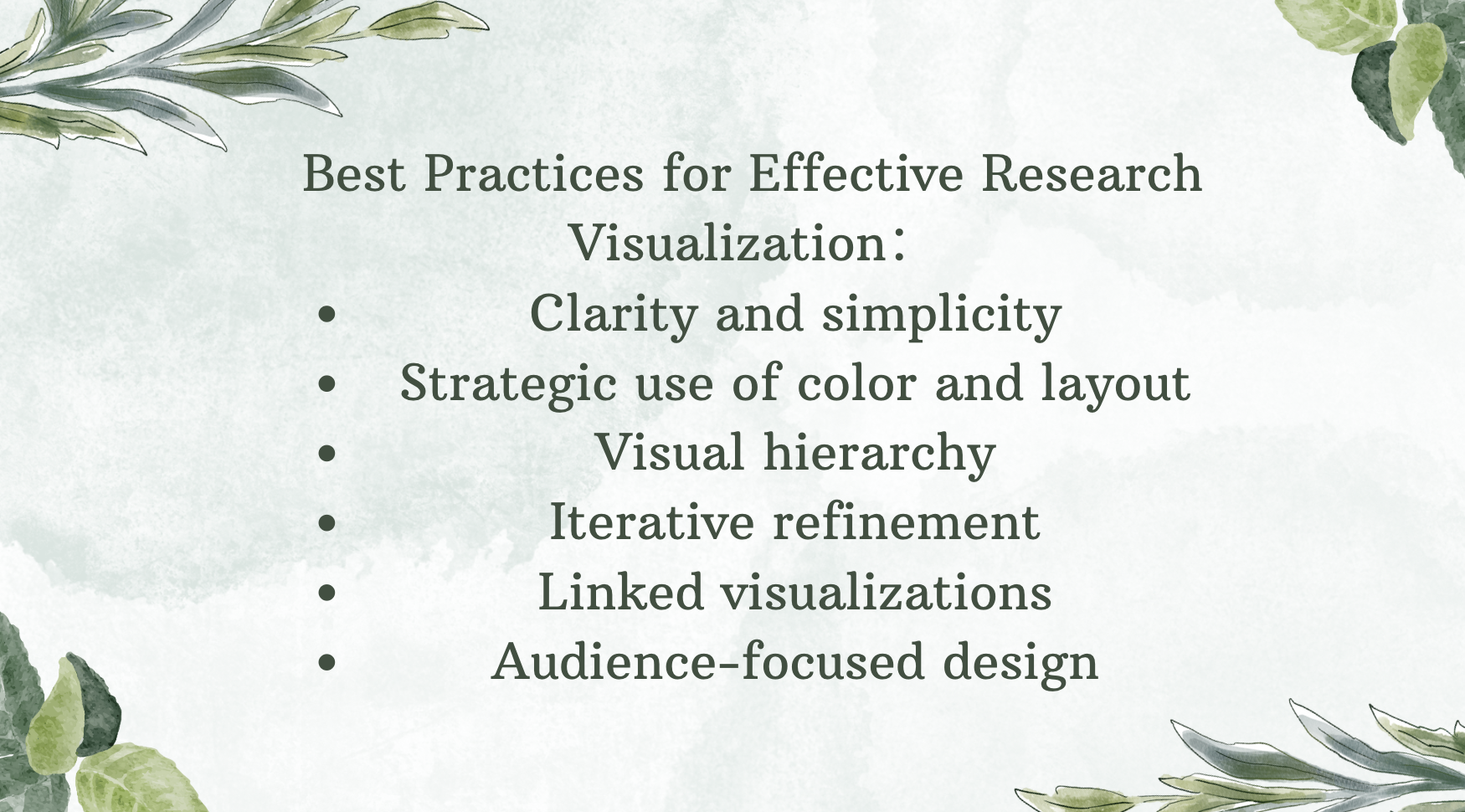
Best Practices for Effective Research Visualization
To maximize the impact of your research visualizations, consider the following best practices:
Focus on clarity and simplicity
Use color, size, and positioning strategically
Start with a clear hierarchy or structure
Regularly review and refine your visualizations
Consider creating multiple linked visualizations for complex topics
Keep your audience in mind when designing visualizations
By following these practices, you can create visualizations that not only enhance your own research process but also powerfully communicate your findings to others. With the right research visualization tool and approach, you can transform complex data into clear, actionable insights that drive your research forward.